Circle of Unity
People holding hands in a circle symbolize global unity in humanitarian service, reflecting the organization's commitment to interconnectedness and solidarity across borders.
A powerful and inspiring emblem representing dedication to serving humanity worldwide, encapsulating the spirit of humanitarian services for the ultra-poor across the globe.
The PETRAD AID emblem is displayed on a royal blue banner featuring the emblem prominently at its center. It is surrounded by a circle of people holding hands, olive branches, and a dove — set against white and yellow wavy lines symbolizing peace, divine collaboration, and the rhythm of natural freedom.
Official emblem adopted January 17, 2018 — the symbol of identity and mission.
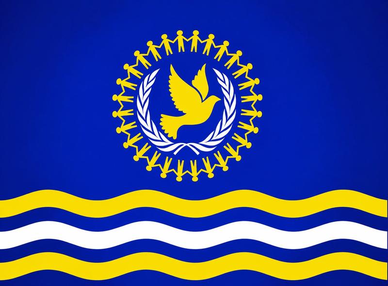
A distinctive royal blue banner carrying a rich history and symbolism, encapsulating the spirit of humanitarian services worldwide.
People holding hands in a circle symbolize global unity in humanitarian service, reflecting the organization's commitment to interconnectedness and solidarity across borders.
A beacon of peace, harmony, and protection, the dove at the center embodies the core principles of PETRAD AID, serving as a guardian of hope for the vulnerable.
Representing peace, hope, resilience, and abundance, the olive branches surround the emblem to declare PETRAD AID's peaceful mission and enduring commitment to communities.
The white and yellow wavy lines denote freedom, natural rhythm, and movement — symbolizing peace, divine collaboration, and the rhythm of natural freedom.
A vivid depiction of the oceans and seas of the world within the emblem, symbolizing unity and the interconnections of all humanity across the globe.
The PETRAD AID colour palette carries deep symbolic meaning — each colour representing a core commitment of the organization.
The emblem was officially adopted on January 17, 2018, and the emblem containing the emblem was first raised during PETRAD AID's first anniversary on January 17, 2019, in Lodwar Town, Kenya.
Lodwar, the headquarters of Turkana County — known as the "Cradle of Mankind" — holds special significance as the birthplace of PETRAD AID's founder. Since its inception, the emblem has stood as a symbol of hope, transformation, and unwavering dedication to serving humanity.
"Since its inception, the PETRAD AID emblem has stood as a symbol of hope, transformation, and unwavering dedication to serving humanity."